
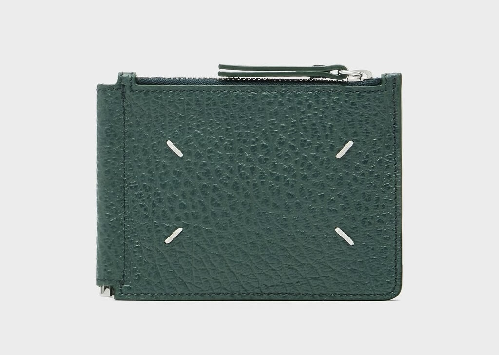
Maison Margiela calls the four stitches on the corner of its bags “the opposite of a label”. No logo, no embossed name, no flag of origin: just four loops of thread pulled through leather and left exposed where most houses would tuck them away.
The stitches bear no name or symbol. But you feel that something has happened: thread drawn through material, tension judged, a corner finished by touch.
It is a small detail that points to a larger movement. In previous pieces in this series, we explored how “Made In” has become a thinner guarantee. Supply chains have fragmented, and a country stamp rarely tells the full truth of where a thing comes from, how it was made, or who had agency in its making.
Yet the pull of origin has not faded. Consumers still look for provenance because it helps them judge quality, imagine place, and feel connected to something more grounded than a product claim.
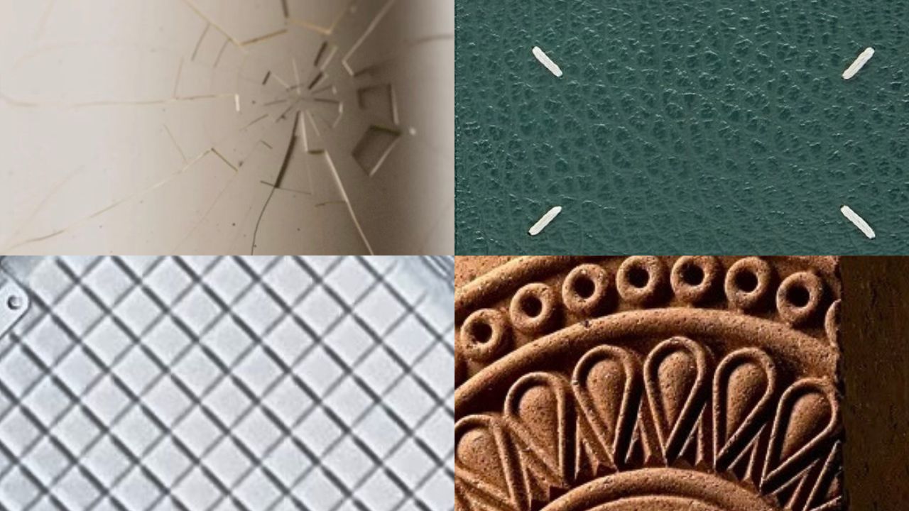
Increasingly, brands are moving beyond “Made In” as a single geographic statement and towards richer layers of origin: made by, made of; made through a particular process, material, landscape, or body of expertise. This article moves one step closer to the object itself: to the stitches, grooves, dents, mould lines, brush marks, ridges and repairs through which origin becomes felt as material evidence.
This is especially visible in fragrance, beauty, drinks and luxury packaging, where provenance, materiality and product experience are often designed into the object itself.
For brands, the opportunity is not to simply add texture, distress or decorative imperfection. It is to use packaging design, product design and material cues more precisely, choosing the signs that credibly express the kind of origin they want people to feel: care, rootedness, transformation, precision or technical control.
As “Made In” becomes harder to rely on alone, origin needs to be more than a line of copy. It needs to be something the product makes tangible.
Why Product Origin Needs Material Evidence
Provenance has long relied on symbolic signs: a country name, a regional seal, a craft motif, a national colour. These can still be powerful, but they are also familiar and easy to imitate. A mark in the object works differently. It gives the consumer something to sense.
Such marks are what is left when something happens to a material: it may be pulled by hand, cut by a tool, pressed by a mould, struck by a hammer. The action is momentary, but its effect remains, held in the surface like a gesture caught mid-motion.
As consumers, we do not only decode this. We feel it. Through what neuroscience calls embodied simulation, the body can re-enact something of the action that made the mark: the press of a thumb, the pull of a stitch, the drag of a blade, the shock of a blow. Each trace carries an absented presence – something was here, something happened – and because we can imagine the movement in our own bodies, the object does not simply tell us it was made. It lets us feel something of the making.
This is what people reach for when origin claims alone no longer satisfy: not more information, but a felt presence of making.
How Brands Can Turn Provenance Into Product Experience
Material evidence of origin can take many forms, from the trace of a thumb to the groove of a machine. The useful question is not only who or what made the mark, but what kind of action the surface makes the consumer feel: pressure, rhythm, resistance, impact, repetition.
These are not fixed categories, but points across a wider field of material signs. Each gives the body a different action to simulate, and gives brands a different way to make origin tangible.
Bodily Marks: Touch and Pressure
The clearest version is the bodily mark: a thumb pressed into clay, a palm shaping wet ceramic, a finger dragging through soft material. The human body is not represented from a distance. It has acted upon the material, and the material has retained the consequence.
Packaging rarely preserves that kind of direct contact at scale. More often, it translates the logic of bodily contact into reproducible form.
Glossier’s You fragrance bottle does exactly this. The thumbprint indent is not newly pressed into every bottle by hand. It is reproduced through a mould. That is what makes it interesting: the bottle turns a bodily trace into a serial feature. We recognise the inverse of a thumb and are tempted to place our own thumb into it. The mark makes touch legible at scale, inviting the consumer to complete the object through their own grip.
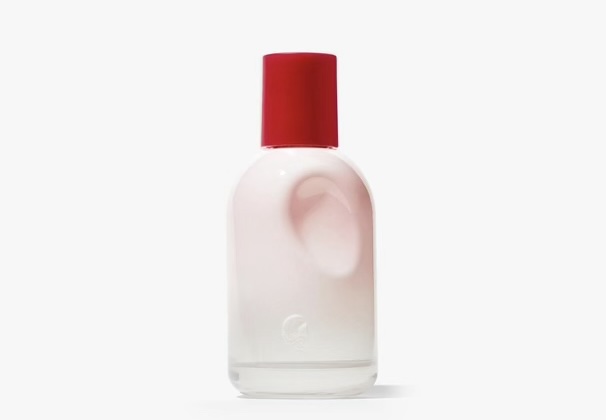
Here, the origin being felt is not artisanal labour in the traditional sense. It is bodily fit, intimacy and personal presence: a product designed around the hand that will hold it.
Crafted Rhythm: Tension and Gesture
Other traces work less through direct pressure than through repeated gesture. Stitches, seams, brushstrokes and hand-painted variation all point back to actions that unfold over time: pulling, spacing, tightening, steadying, correcting.
Hermès’ saddle stitching makes this rhythm visible through tension and repetition. The consumer may not know the exact technique, but the line of thread carries an impression of care: the pull through leather, the steadiness of the hand, the time held in repeated decisions.
Clase Azul and Grand Mayan’s hand-painted ceramic bottles create a related effect through brushwork. The value is not only that each bottle is different. It is that the line, variation, and slight unevenness of application make the painting action perceptible. The surface lets us feel something of the controlled hand behind it: a sequence of gestures, pressures, and decisions.
These signs are especially powerful for brands that want origin to feel cared for, disciplined, or humanly attended to. Their effect is quieter than rupture or impact. The body senses time, steadiness, and repetition.
Physical Resistance: Carving, Chiselling, and Worked Surfaces
Some material signs centre on the encounter between a tool and a resistant surface. A carved edge, chiselled relief, cut facet, or hammered texture makes us feel that matter has been shaped through contact.
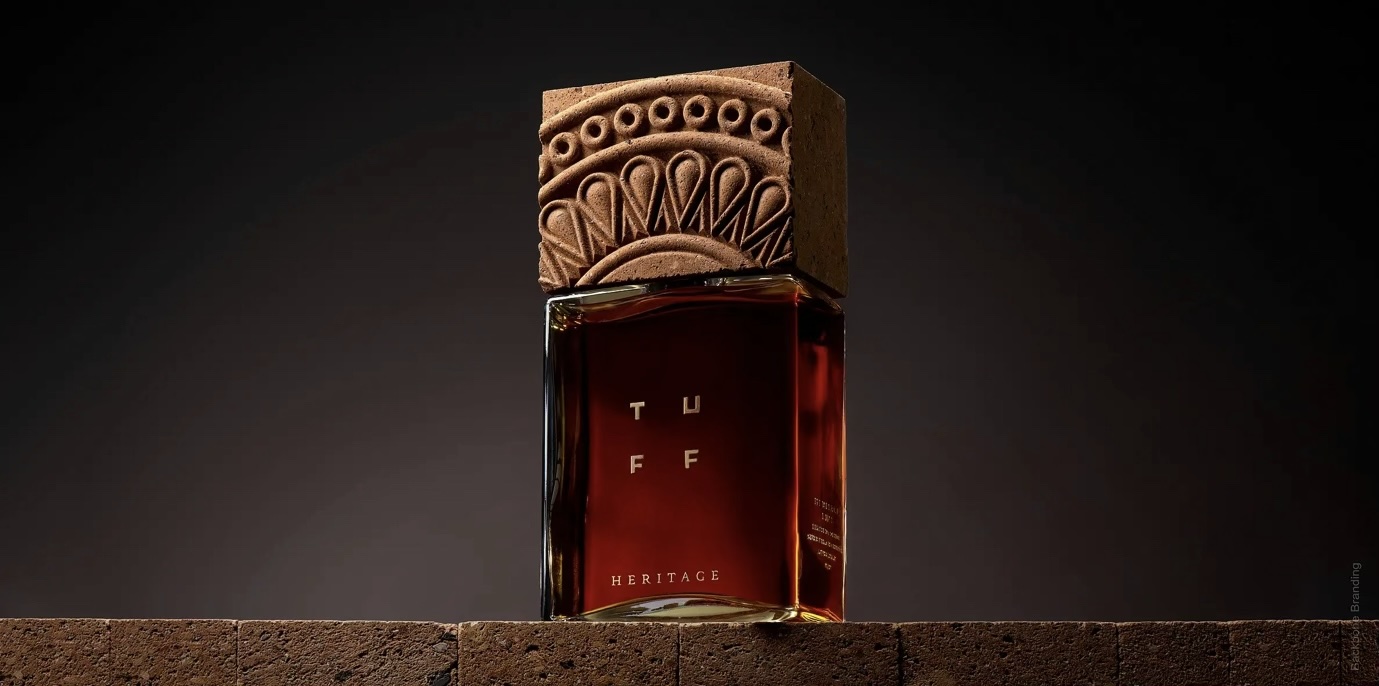
Tuff Heritage Brandy makes this relationship unusually explicit. Its cap is hand-carved from Armenian tuff, the volcanic stone central to the country’s architecture. The reliefs, edges and indentations show where the tool has met the stone. We can sense the pressure of carving: the resistance of the material, the force needed to cut it, the slowness of shaping something hard by hand. The cap carries a sense of place through material, but also through the action of working that material.
Volcán de mi Tierra uses moulded glass to make landscape tactile. The base is shaped to resemble the Tequila Volcano, while hammered textures across the body echo volcanic soils and Jalisco terrain. The bottle gives the hand of the consumer a worked surface to follow, turning geography into texture, pressure and form.
In this mode, origin is felt through physical resistance. The brand does not only say where the material or reference comes from; it lets the consumer sense that something had to be shaped, cut, pressed, or formed.
Destructive Impact: Rupture and Repair
Some traces are more visceral because they point to sudden force. Dents, cracks, crumples and repairs hold the moment where a surface was struck, broken, compressed or put back together.
Tom Dixon’s Bash vessels make this direct. Each piece is formed from a single sheet of brass, hammered into shape. The dents, folds and crumples render the blow visible and tangible. The body does not experience this as careful rhythm. It senses impact: the strike, the collapse, the metal giving way.
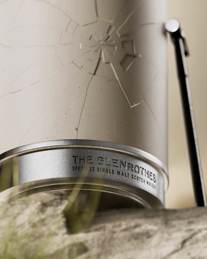
The Glenrothes 51 turns impact into ritual. The bottle is encased in a Jesmonite column that the owner must smash open with a hammer. The fragments can then be restored through kintsugi, making rupture part of the ownership experience rather than a flaw to be hidden. Access to the whisky is staged as force, breakage and repair.
Dries Van Noten’s Soie Malaquais collaboration with Bouke de Vries works in a more delicate register. Delft-inspired porcelain fragments are reconstructed around fragrance flacons, so the object holds both breakage and mending at once. The body can sense the shock of the fracture, but also the patience of putting fragments back into relation.
These signs create a different feeling: charged, transformative, sometimes unstable. For brands, they can make intensity, release, fragility, or resilience felt in the object itself.
Automated Manufacturing: Precision and Repetition
Material evidence does not have to point back to the individual hand. Contemporary products are also shaped by moulds, machines, software, serial processes, and engineered systems. These processes leave signs of their own.
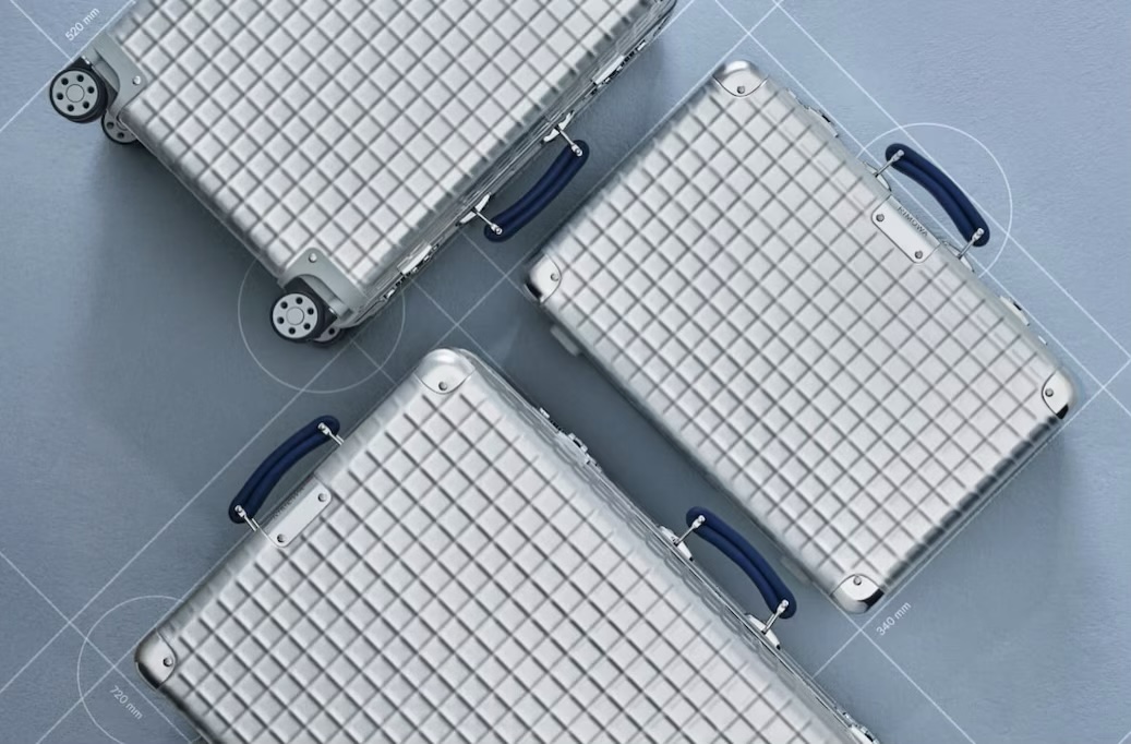
RIMOWA’s aluminium cases are a clear example. Grooves, rivets, pressed structures and engineered surfaces do not pretend to be handmade. They make industrial construction part of the product’s identity. The case feels precise, repeatable, and built for movement. Its origin is expressed through technical confidence.
A similar logic appears in brushed, grooved, and radially worked metal across premium packaging. Rabanne and Guerlain use brushed gold effects, cross-hatch motifs and radial grooves on candle jars, diffusers, and lids. These surfaces catch light as the object turns, but they also invite twisting, gripping, and touch. The circular marks suggest rotation, machining, and control.
Additive manufacturing opens another route. The ridges of 3D printing are often treated as flaws to be smoothed away, but designers such as Bilge Nur Saltik and Ohhio keep the layered build-up visible. Those lines show the object being built gradually, one pass after another. The machine has stopped, but the rhythm of its making remains in the surface.
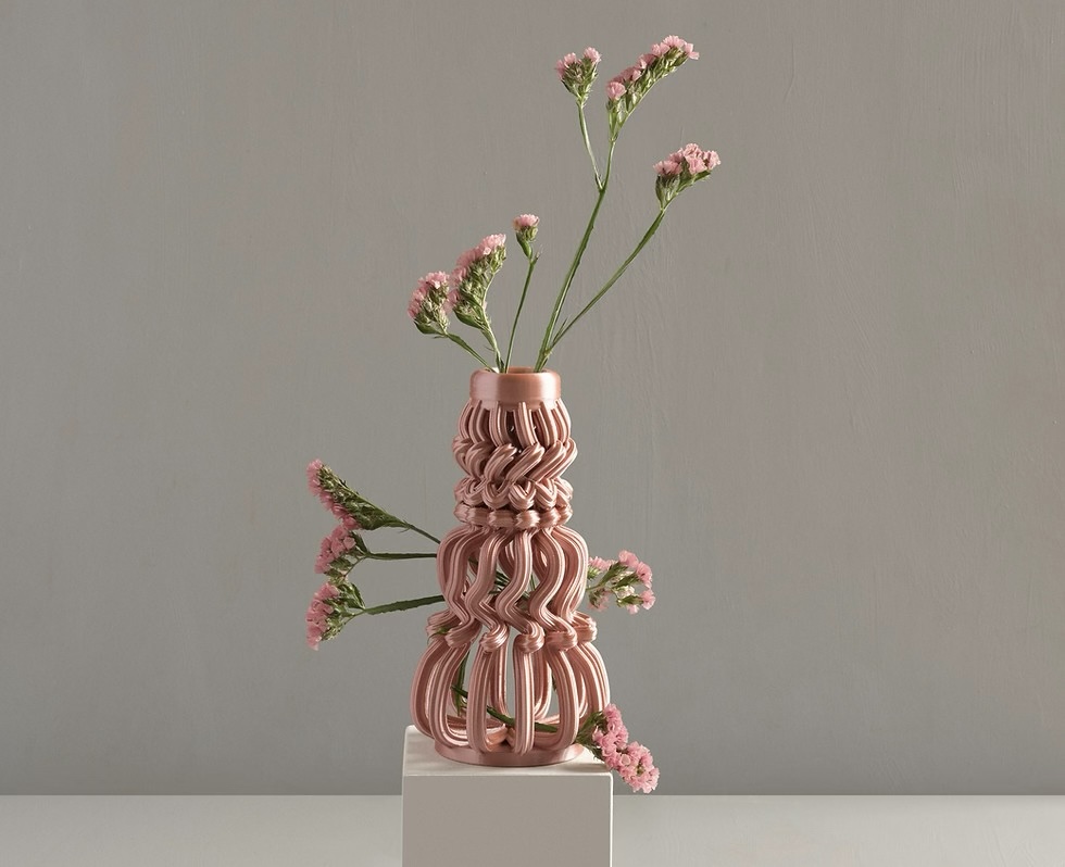
This means “Made By” is no longer only about the individual artisan. Many products are authored through machines, moulds, digital files, suppliers, materials, and human judgement at once. Mass-produced brands do not need to borrow the language of handcraft to make provenance felt. They need to understand what kind of evidence their own production systems can credibly leave behind.
Matching Material Cues to Origin Stories
The real question for brands is not simply what origin story they want to tell, but what kind of material evidence can make that story feel true.
If origin needs to feel cared for, the product may need signs of rhythm, tension, and repeated attention. If it needs to feel rooted in place, it may need material choices and worked surfaces that connect landscape, matter, and process. If it needs to feel transformative, rupture or repair may do more than polish. If it needs to feel precise or future-facing, the signs of moulding, machining, or additive manufacture may be more credible than borrowed craft cues.
Get this right, and origin stops being a line of copy to be defended. It becomes something the product does on its own, every time it is picked up.
8TH DAY works with brands to help diagnose and design this gap between symbolic intent and felt experience through an offering we call Imprint.
Provenance, in the end, is not only stated on the label. It is held in the object: in its edges, seams, surfaces, and signs of making.
References
- https://www.maisonmargiela.com/en-gb/four-stitches-wallet-SA1UI0022P4455T7162.html
- Declerck, S. (2024) Towards ‘feeling-with’: A speculative proposal fora relational design aesthetics of tactile affect. PhD thesis. Loughborough University London. Available at: https://repository.lboro.ac.uk/articles/thesis/Towards_feeling-with_A_speculative_proposal_for_a_relational_design_aesthetics_of_tactile_affect/26763883?file=48621925
- https://uk.glossier.com/products/glossier-you?srsltid=AfmBOooA1MZu_dBeAumm4jaeOD2ctG81v7azZEaxO3LrPD_4FlVJdNX8
- https://backbonebranding.com/works/tuff-heritage/
- https://www.theglenrothes.com/en/the-glenrothes-introduces-the-51
- https://www.rimowa.com/gb/en/stories/classic-aluminium-grid-introduction.html
- https://www.bilgenursaltik.com/copy-of-deviation-space-1