
In storytelling, we’re told, “Show, don’t tell”. But when it comes to packaging, even showing can fall short. Too often, packs are designed for the eye, while the way they feel, the way they're opened, handled, or remembered is treated as secondary.
Most brand and packaging strategy still centres on symbolic cues: visual, linguistic, and cultural codes that are interpreted through learned conventions. Serif typography signals tradition. Pink suggests femininity. Gold implies heritage. These are decoded cognitively, but not necessarily felt.
The issue is that this symbolic layer, while powerful, is just one level of meaning-making. What’s often missing is how the body experiences the pack. We simulate its weight, anticipate its motion, feel its texture. Meaning isn’t declared through symbolism alone; it’s enacted through the senses.
When symbolic design isn’t enough
Traditional semiotics often asks, "What does this signify?" But if we only analyse colour, iconography, or codes, we miss the lived, embodied interaction between person and pack. Packaging is not just a canvas for storytelling, but a physical encounter. It’s a chance to build emotional resonance not through metaphor alone, but through sensation.
As an example, take the redesign of a prestige whisky bottle. The brand positioned the new bottle as the lightest 70cl bottle ever made. While it delivered a clear sustainability message, the pack itself was encased in a solid, cage-like sleeve and used squat, visually weighty proportions. To the eye, everything about it said heaviness, even though its actual mass told another story.
But because it was a limited-edition bottle, most people never picked it up. The contradiction – potentially quite powerful – was never felt. The semiotic signals didn’t align with the embodied experience. All in all, a missed opportunity to make lightness tangible and multisensory.
A more embodied understanding of meaning
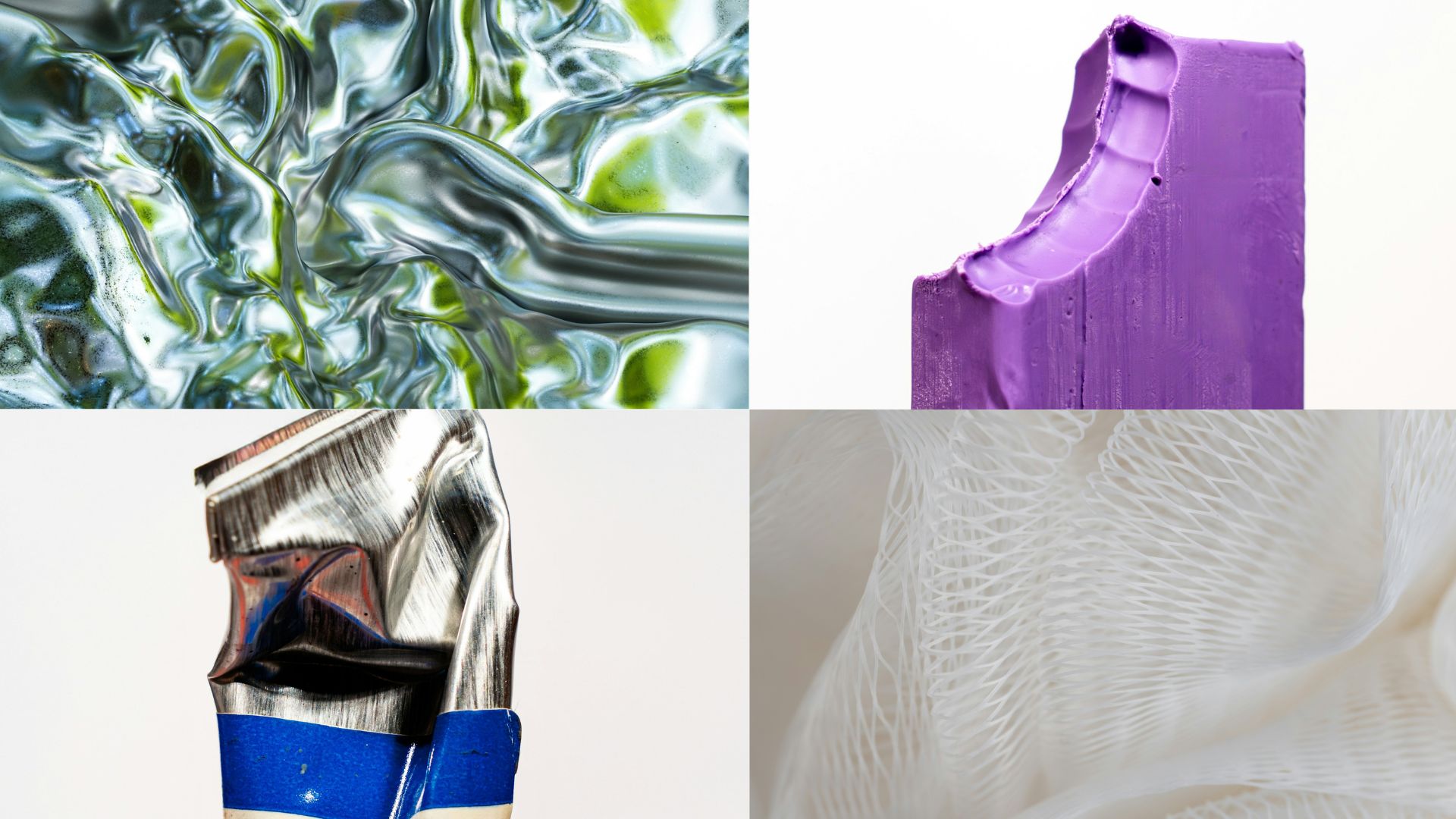
Research in neuroscience and embodied cognition challenges the idea that meaning is created purely through symbolic interpretation. Instead, it shows that meaning is deeply rooted in the body’s physical interaction with the world. Rather than working with five siloed senses, this perspective explores how perception arises through multisensory integration: how texture, weight, motion, temperature, and resistance shape understanding in intuitive and often unconscious ways.
It’s a shift from visual semiotics to sensorial alignment — from asking, "What does this look like it says?" to instead, "What does this feel like it means?"
That distinction matters. A heavy glass base isn’t just a luxury code: it simulates stability, depth, and permanence. A rough edge doesn’t simply say “craft”; it carries a trace of the force used to shape it. It gestures to the maker’s hand, to the resistance of the material, to the motion that left its imprint. These tactile traces become cues of time, care, and authorship. An unfolding motion, by contrast, can express blooming, intimacy, or transformation. These are embodied metaphors, rooted in how we move through the world.
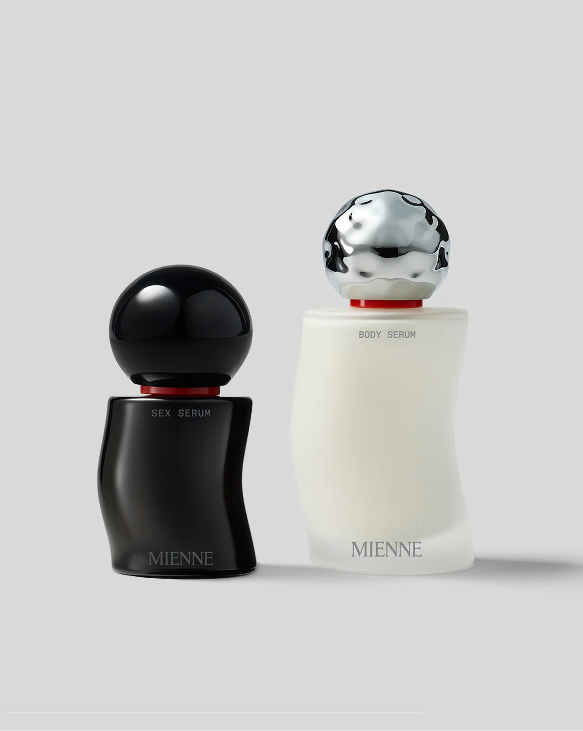
One example I often come back to is Mienne, a luxury wellness brand. They use unusually heavy Zamak caps that are denser than the glass bottles they top. The material is cool to the touch, and the form is sculptural, weighty – almost like a paperweight. These details signal care, permanence, and sensuality through the fingers before the mind even processes it. It's a good example of a brand designing meaning through material, not just messaging.
Why it matters in today’s context
The demand for lighter-weight packaging is reshaping the design landscape – not just for environmental reasons, but to reduce costs in materials and transport. But stripping away material weight can also strip away the cues that convey value. A light pack can feel cheap, unless it’s carefully designed to look and feel intentional.
In our work with a global spirits brand, we explored how to reduce glass weight while maintaining a sense of gravitas. We proposed shifting visual weight downward: bulging the base, deepening the punt, and adjusting colour gradients so the eye reads density without added material. We also looked at how label placement, darkened tones, and edge thickness can evoke weightiness without the mass.
Similarly, for a fragrance house transitioning from transparent to opaque bottles, we helped rethink how freshness and fluidity could still be felt: brushed metal surfaces, matte finishes with directional grain, and structures that visually echo the movement of water. When transparency disappears, tactility is tasked with carrying more of the message.
As physical retail shifts and digital experiences expand, packaging often remains the only tangible point of contact with the brand. In categories like skincare, fragrance, spirits, and snacking, it’s inseparable from the product itself. The bottle, jar, tube or wrapper shapes not only first impressions, but also the expectations and gestures through which the product is encountered. And unlike advertising, it doesn’t disappear after the point of sale; it lives with us through use, ritual, and eventually, disposal.
Imprint: Our offer
Imprint is our approach to packaging that starts not with the visual, but with the experiential. It’s built to capture how packs are held, handled, and imagined… not just how they look on shelf.
We draw on embodied metaphors (e.g. lightness as upward motion, intimacy as enclosed curvature), indexical signs (e.g. patina, asymmetry, tactile traces of making), and cross-modal correspondences: how, for instance, a rough matte surface can cue a dry or sharp flavour profile, or how rounded contours and gloss might suggest a dewy texture or sweet fragrance.
Imprint can enter in at different stages of the development process, whether you're rethinking a brand’s packaging system, introducing a new material, aligning a product with evolving category codes, or simply trying to brief your creative partners with more precision. It can support innovation teams in identifying sensory tensions, inspire concept routes, or produce a set of guidelines to embed across packaging portfolios. The application flexes, but the intent is consistent: to surface layers of meaning that consumers often feel, but rarely articulate.
Imprint can also intertwine with other methods, such as focus groups. In a skincare packaging study, for instance, we paired consumer insights with a semiotic layer that highlighted why certain designs felt intuitively premium, whether through processing fluency, sensorimotor rhythm, or subtle traces of time. These weren’t just aesthetics; they were signals of trust, efficacy, and care, embedded in the sensory design.
Why it matters for your brand
Imprint helps brands bridge the gap between symbolic intent and felt experience so that what a product stands for is felt as clearly as it’s seen.
Whether you're trying to express intimacy without cliché, luxury without weight, or innovation without coldness, we help align the sensory with the strategic.
Packaging is a handshake. It’s held, opened, and lived with. And if it only speaks to the eye, it's only doing half the job.
If you’d like to explore how Imprint could work for your brand, drop us a line at hello@8th-day.com
References
- https://mienne.com